3.2 Trading with Charts
The main objective of using charts is to analyze price movements, define price trends and patterns. Learn how to read, interpret and customize the different types of charts - line chart, bar chart and candlestick chart – in this video.
Complete this course


Script
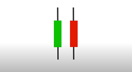
Most traders use price charts to some extent. Three commonly used charts are the line chart, the bar chart and the candlestick chart. A line chart consists of price points connected by a line. A bar chart shows the opening price of the instrument, in other words, the price that the product opened trading at that morning. The bar also shows the closing price. The additional length of the bar beyond the opening and closing price are the day’s highest and lowest prices. A candlestick chart is the same as a bar chart, but many traders find it easier to read. It is thicker, and the color indicates whether the closing price was higher or lower than the opening price. The length of the candle wicks, or tails, show the price movements of the day. There are many ways to customize your charts. You can adjust periods, add trading volume, define colors and place all kinds of reminders for yourself. The main point of charts, though, is to analyze price movements to find price trends and patterns. There are countless analyses included in your trading platform. If you wish to learn more, please watch the videos about support and resistance levels and price trends and patterns.